Posts

Showing posts from September, 2023

#PeerReviewWeek2023

Image
How was it for you? I'm tired, but I liked it... 😳 Listen... I made an effort! I really wanted this to come to the world fully formed yesterday...  It didn't happen. Too much information and "zooms" make me groggy... So, here we are. End of #PeerReviewWeek2023. My first full one.  How was it for you? I'm tired, but I liked it...      I promised a post a day, so I'm due one. This one. I want to tell you all about how I do this thing. Peer review is not an art form. It's work. We can break it down into a process. How do you become a good peer reviewer? Not to brag, but already doing it, I'm quite good 😎 ( did you see this? ) Here are some top tips: Read. In your area, in areas adjacent, sometimes in completely unrelated ones.  It's good to be aware of different styles and conventions, as they all have features we can learn from .  Reading keeps you up to speed with the latest developments in your field, and it is a good habit to maintain if you wan

Seeing it all at once with infographics

Image
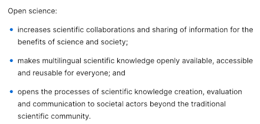
I've had a busy couple of weeks, and it seems I'm just over the hump today. For someone such as me, used to dealing with a cat and not much more, attending conferences —even if virtually— is quite exhausting. But it's been worth it. I've learned a lot and got to know wonderful humans.   Dr Ana Persic is Programme Specialist for Science Technology and Innovation Policies and Open Science at the UNESCO Headquarters. She gave a very detailed and engaging presentation on what is open science.  According to the recommendation produced by UNESCO , This is all very well and good (really... it is!), but nobody would pay attention to it. Do you know how the audience felt attracted? With infographics .πŸ‘‡ If you say that the content is the same, you'd be wrong. Although it's the same text, this visual representation provides a stronger storytelling structure for a summary. And here, at Storytelling for Science, we really like those! This infographic also displays the ot

Graphical abstracts boost paper citations

Image
There is a new beast in town... In the age of short form social media posts and lack of time to read, visual representations are extremely valuable. A new entity, called graphical abstract was born.  A graphical abstract is a single image designed to assist the reader in quickly gaining an overview of the manuscript. It accompanies the written abstract but does not replace it.   I would never dream of expanding on design concepts I know nothing about. So, I'll defer to the experts.πŸ‘‡ A lot of cool designs are available from some of the most well-known platforms, such as BioRender , Mind The Graph , and Animate Your Science . Given the complexity of making design concepts work for summarising the main take-home message of a scientific paper, these are typically used on social media and journal websites. They usually have little to no text at all, and communicate with other elements of the scientific paper, whilst still being self-explanatory. The purpose of a graphical abstract

Reusable methods for Open Science

Image
It's Peer Review Week 2023! This is the second post of this week, so we're discussing how reporting of methodology came to be regarded as an asset to the reproducibility initiative. Stick around and follow daily! If you want to read why the scientific method was developed, check it here . If you want to know why you should care, read on.   Promoting Reusable and Open Methods and Protocols ( PRO-MaP ) is a set of recommendations aimed at improving the reporting of protocols in the life sciences.    I first heard of this initiative through my work at Bio-protocol . This is an online peer-reviewed protocol journal that curates and hosts high quality, free access, step-by-step protocols across the life sciences. Although relatively recent, it's by no means unique . The expansion of protocol sharing led to the establishment of detailed guidelines for preprints, and validation sections were introduced in protocol articles. The detailed features of these protocols, structured

The right way to use AI is pioneered by Lefty

Image
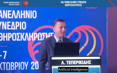
It's Peer Review Week 2023! This is the first post of this week, so we're discussing reading other researchers' work, how this impacts our own, and the broader community. Stick around and follow daily! If you want to know how i do it, check it here . If you want to know why you should care, read on. Eleftherios Teperikidis is the lead author of the first AI-powered systematic review .   One of the most interesting articles I read in recent weeks has been one on using artificial inteligence (AI) for research... It's called Prompting ChatGPT to perform an umbrella review . For me, the most remarkable feature of this publication is it dispassionate analysis of the advantages and disadvantages of using AI tools in scientific writing.   ChatGPT was successfully prompted to execute nearly every step of the systematic review process, by using PICO (Problem, Intervention, Comparison, Outcome) as a universal technique to approach the scientific writin g process. There has bee

Looking forward to the discussion

Image
After you have been inundated with data , tables and figures , images and infographics , you want a take-home message . The discussion section is where you explore the meaning , importance , and relevance of your results . It has been called " the heart of the paper " and " your closing argument ".  You want people to finish reading your paper with a clear idea. Help them think.   Imagem de Colin Behrens por Pixabay . 🚫 Don'ts Restate the results   Introduce new results                       Discuss tangential findings   Criticize marginally related work Unnecessary speculation   Lengthy text   Components of the discussion   Answer ✅  Pick up where you left off in the introduction —remember setting the scene, placing the study in context, and justifying your study's aims?  Answer your own research questions by summarizing your key findings. Interpretration   πŸ‘€ Identify correlations, patterns, and relationships among the data. Consider alternativ

This is new!

Image
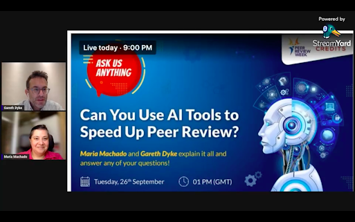
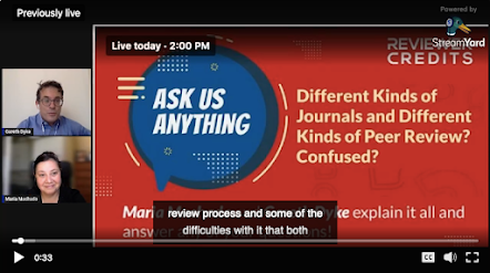
I did a thing... πŸ‘€ well, a couple of things! πŸ˜… I became aware of ReviewerCredits just recently. I connected with the Managing Director, Sven Fund , and we had a couple of chats on the different ways in which peer review can advance in the future.  Gareth Dyke , the Scientific Director, invited me to participate in a podcast (you can listen to me from 13:00 here ). I must of sounded ok, because I was invited to join Gareth as the co-host in this event on LinkedIn Live ( Maria and Gareth AMA ), which was an experience like nothing else for me! Look at my face, I'm so uncomfortable!   This taught me something: whatever your profession, jump to the uncomfortable place. πŸ’£Listen to your own voice (yuck! 😝) and watch your own face react (double yuck! 😳). I hope to have even more chances to share what I love doing with the world: promoting clear scientific and biomedical knowledge, accessible to all!      

Data (part II): tables and figures

Image
Data is what we live for... but its presentation is critical for clear understanding. First state the general parameters, then get specific. Give the readers an idea of the representativeness of the research data, then state key findings and relevant analyses. Choosing the appropriate format for reporting research results is essential. If data are presented in a figure or table, there is no need to repeat these in the text.   Qualitative research (such as surveys and interviews) generates textual data πŸ”‘ that can be presented in a table (or matrix ) format.  Tables   ✒ T ables are generally used to present large amounts of numerical information. πŸ“‹   ✒ Table titles are placed above the table . ✒ C olumns and rows within tables also require clear headings : t his usually means that demographic characteristics (such as age, sex, or race) are listed in rows , while columns are used to divide participants per treatment group, and present relevant comparisons.  ✒ For the table to be