Seeing it all at once with infographics
I've had a busy couple of weeks, and it seems I'm just over the hump today. For someone such as me, used to dealing with a cat and not much more, attending conferences —even if virtually— is quite exhausting. But it's been worth it. I've learned a lot and got to know wonderful humans.
Dr Ana Persic is Programme Specialist for Science Technology and Innovation Policies and Open Science at the UNESCO Headquarters. She gave a very detailed and engaging presentation on what is open science.
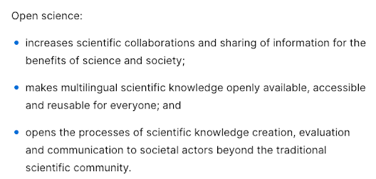
According to the recommendation produced by UNESCO,
This is all very well and good (really... it is!), but nobody would pay attention to it. Do you know how the audience felt attracted? With infographics.👇
If you say that the content is the same, you'd be wrong. Although it's the same text, this visual representation provides a stronger storytelling structure for a summary. And here, at Storytelling for Science, we really like those!
This infographic also displays the other characteristics of an effective tool, which are presenting most of the information on short texts or topics, and fitting on a single page, that is then incorporated inside a more extensive text document.
This is a wonderful way to promote the concept of open science, through dissemination via slides, posters, and handouts.
This is quite a feat, to introduce design elements and concepts in an otherwise heavily technical text. And I hear you ask: "We already need to master so much whilst doing research, do we really need to learn design as well?"
No. Not really. The same concept, to produce something that is visually striking and promotes audience engagement, can be done at a far more modest scale. Just let your imagination loose, and have fun!
 |
| Kamoun, Sophien. (2021, November 21). Don't perish! A step by step guide to writing a scientific paper. Zenodo. https://doi.org/10.5281/zenodo.5716816 |


This was visually appealing and I can see the difference.
ReplyDelete