Posts

Showing posts with the label Pretty!

Pride and Respect

Image
Pride month just finished... So why is this relevant for academic publishing? I have a conflict of interest, as this is personal to me. This also means I feel obligated to clarify, educate, and mitigate biases whenever possible.  Sex refers to a set of biological attributes in humans and animals that are associated with physical and physiological features, including chromosome expression, hormone function, and reproductive/sexual anatomy. Gender refers to the socially constructed roles, behaviours, and identities of female, male, and gender-diverse people. It influences how people perceive themselves and each other, how they behave and interact, and the distribution of power and resources in society. Terms that define identity Apart from gay men, lesbians, and bisexual people, it is necessary to recognize, Asexual : An individual who experiences a lack of attraction to other persons of any sex or gender. Pansexual : An individual who experiences attraction to people regardless of g...

A letter to Santa

Image
I've been a good reviewer, not given in to unwarranted comments on laguage, not given in to unjustified criticism, and always submitting my reports on time.  I think I deserve some gifts 😝 Peer reviewer recognition wouldn't go amiss.  Here are some thoughts on how to make the academic reviewers in your life a bit happier, relaxed, and less prone to behaving like Reviewer 2 . 1. Institutions should allocate time for peer review within their faculty appointments The time it takes to do a good job with a peer review is often underestimated. ⏳ Given that this work is not financially compensated, at least time for it should be granted as part of the expected commitment to the scholarly community. 2. Graduate courses could teach peer review, much like they teach statistics There are techniques, concepts, and skills required to perform peer review. It is important ...

Seeing it all at once with infographics

Image
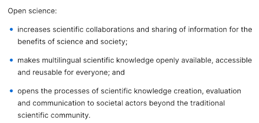
I've had a busy couple of weeks, and it seems I'm just over the hump today. For someone such as me, used to dealing with a cat and not much more, attending conferences —even if virtually— is quite exhausting. But it's been worth it. I've learned a lot and got to know wonderful humans.   Dr Ana Persic is Programme Specialist for Science Technology and Innovation Policies and Open Science at the UNESCO Headquarters. She gave a very detailed and engaging presentation on what is open science.  According to the recommendation produced by UNESCO , This is all very well and good (really... it is!), but nobody would pay attention to it. Do you know how the audience felt attracted? With infographics .👇 If you say that the content is the same, you'd be wrong. Although it's the same text, this visual representation provides a stronger storytelling structure for a summary. And here, at Storytelling for Science, we really like those! This infographic also displays the ot...

Data (part II): tables and figures

Image
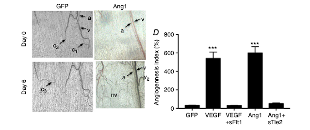
Data is what we live for... but its presentation is critical for clear understanding. First state the general parameters, then get specific. Give the readers an idea of the representativeness of the research data, then state key findings and relevant analyses. Choosing the appropriate format for reporting research results is essential. If data are presented in a figure or table, there is no need to repeat these in the text.   Qualitative research (such as surveys and interviews) generates textual data 🔡 that can be presented in a table (or matrix ) format.  Tables   ✒ T ables are generally used to present large amounts of numerical information. 📋   ✒ Table titles are placed above the table . ✒ C olumns and rows within tables also require clear headings : t his usually means that demographic characteristics (such as age, sex, or race) are listed in rows , while columns are used to divide participants per treatment group, and present relevant comparisons...

Data: raw, analysis, and presentation (part I)

Image
So, what did you find? You've found a research gap and developed a hypothesis 🔍🔎 You've chosen the appropriate study design to test your hypothesis ❌❎ You've collected data from the experiments you conducted 📙📀 And now? The results section is the one that conveys the importance of a manuscript, but the collected unprocessed data is raw. A bunch of numbers, quotes from surveys, or images won't give you any insight 😕 ; not if you don't have a plan for data analysis.   When reporting data, it is important to be clear, brief, and accurate. And remember that the most visually appealing section of the paper must have a polished presentation. 💅 Look at all the pretty pictures and charts! I'll be illustrating the points below using examples from the results section of the research paper by Stone et al . (J Physiol . 2017;595(5):1575-1591. doi:10.1113/JP273430).   Outlining and analysis My academic mentors always asked me to plan out what the figures in a manus...